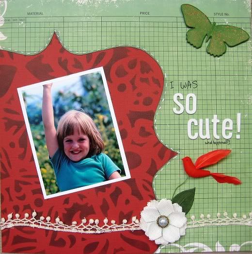
 I inked the cardstock using a Maya Road mask, stitched the paper onto the cardstock, made the butterfly, laid out all the crochet, flower, bird and leaf parts... then realised that I hadn't really thought it all through!
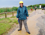
Finally went with this picture solely because I'm wearing a green t-shirt and I'm outside, so I sort of match both colour and theme! Even managed a suitable title. Quite happy with the way this turned out.


19 comments:
You have every reason to be happy with this layout. it is great and how it came together is so cool
nice one Laura, and I can still recognise you from the pic.
... and you are still cute! A super page!
Sue x
Love this page - esp the bird :-)
So cute and luv the bird!
So cute and luv the bird
I love how you laid this out - balances the action of the photo. Well done.
Oh yes, the title says it all! Love that trim and the page isn't bad either!!
Wow, I think this layout is stunning...the colors are wonderful, and the picture is adorable!
love the wavy ribbon and the red background really makes the blue in the photo stand out. Totally love it!
This is cute! I love how you placed the photo askance on the red paper - nicely done.
Lovely use of the kit again Laura, love that bird and of course the cute photo.
Beutifully simple page and I love the green background paper.
Jennie X
Definitely cute!! Love the way the wavy ribbon compliments the shape of the red xx
Gorgeous page! I love the misting and I think you did a great job!
It's such a gratifying feeling when a layout just falls together like that. Great page. Cute kid ;-)
Your masking looks so great I thought the paper was store bought
I just pinned your layout to my Pinterest...I love masking, bracket paper and grid paper, but have a hard time usinng them and making them "look right". Much less using all 3 together!!! PERFECT!
*meridy*
What a beautiful layout. I like the diecut and red birdie embellishment.
Post a Comment