Monday, 30 August 2010
York

Saturday, 28 August 2010
The Bottom of the Venus
I wanted to do something non-Halloween with the gorgeous new Halloween papers from MME - strokable flocking! - and this is what I made.
Everyone was taking pictures of her front and the crowds were so large it was hard to get a decent front shot. So I decided to be different, go round the back and get this angle of her instead!
 I was also able to use the stamp set that I bought simply because it featured the Venus de Milo...
Everyone was taking pictures of her front and the crowds were so large it was hard to get a decent front shot. So I decided to be different, go round the back and get this angle of her instead!
 I was also able to use the stamp set that I bought simply because it featured the Venus de Milo...
Sunday, 15 August 2010
In which I use Glimmer Mist for the First Time!
I bought myself a set of Glimmer Mists that were on sale and when they arrived I couldn't wait to use them all. As you can see, I've not quite grasped the concept of using them lightly and subtley. The mist came out rather more as a deluge, but I guess that's part of the learning process.

Also used the Blended Ink Tutorial that I found on Studio Calico. I think I had rather more success with that than I did with the misting!
 I seem to have gone from someone who doesn't stamp to someone who stamps on everything...

And this is what happened when I tried to Mist through a Crafters Workshop template!

Very runny and blobby! Another thing that requires practice. Must go in search of a tutorial!
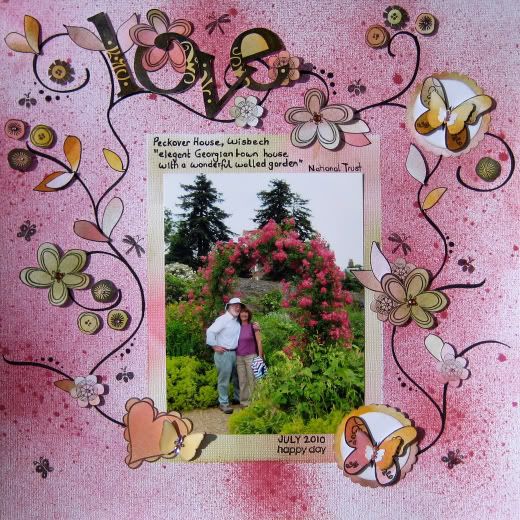
Also used the Blended Ink Tutorial that I found on Studio Calico. I think I had rather more success with that than I did with the misting!
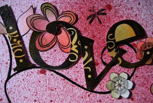 I seem to have gone from someone who doesn't stamp to someone who stamps on everything...
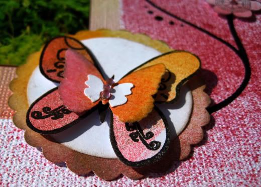
And this is what happened when I tried to Mist through a Crafters Workshop template!
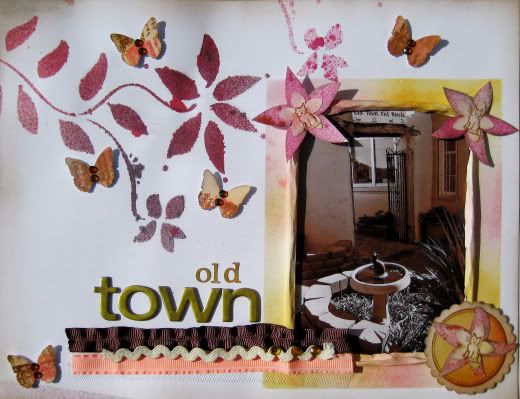
Very runny and blobby! Another thing that requires practice. Must go in search of a tutorial!
Friday, 6 August 2010
Tatty and Tarepanda

Also found a card a I bought with a Chinese phrase on it. I remember I bought that because I regretted not buying more cards when I was in China.
So I chopped up the card and inked it up for a title. This is a mere 18 of the Tarepanda stickers, but it's a start.
I then looked up 'panda' in Chinese. It's actually 'bear' plus 'cat' and in one of the stickers the panda is dressed as a cat!
Wednesday, 4 August 2010
Grinding and Sight-Seeing
 I forgot to upload this one in time for the Weekly Challenge on UKS last week, still it was done in time. You had to use brights, ribbon and a page size that you don't often use. It's been a while since I did an 8x8, so I went with that. I've also been wanting to use up more of my scraps, so I made this from Christmas papers. Next challenge to Self will be a non Halloween layout using Halloween papers. I have a lot of them now and very few pictures from Halloweens.
 Just a quickie of Edinburgh Castle. You can see me reflected in it...
Creative Craft World Challenge
Here's my entry for the latest Challenge at Creative Craft World. This time it was a sketch challenge, gotta love a sketch!
 {The View from from Welches Dam RSPB Reserve}
I've been doing a lot in 8.5x11 recently, but forgot to scale the sketch to the paper after I decided to flip the sketch! It was after I stuck the title down that I realised what I'd done wasn't what I'd planned to do, still, I like it.
My process was different this time. After spending ages colour coding my buttons, brads, cardstock and blooms they're now all easy to get at, easy to pull out the pots that match the photos... it's lovely!
I'm not going to sort my papers by colour. I'm still too much of a Paper Snob to let certain Companies mix with other Companies! But I do know what I own and what the colours are, so I pulled out all my pieces of red and green for this in the hope that I could mix them up. It didn't go as well as I'd hoped, the main papers are still both from the same collection (Cosmo Cricket - Garden Variety), but there is a Basic Grey rub on in there, and a punch from a matching paper and a Fancy Pants overlay that's been sitting around for ages.

Layering! Hurrah! Thanks to Wendy and Christine I will never let an unlayered embellishment near a layout again. :) Besides, it helps me to overcome my Snobbishness and mix up those Companies. This one fetaures stash my Dad bought from a boot sale, BG Cupcake, BG Boxer, Crate Cottage, Prima, American Crafts and a flower that came from goodness only knows where!

 This one is my favourite. It's a shame that the Boot Sale Stash only had one piece of each item, so that's the ruffley green ribbon all gone and the red button with the doodly edge all used up. Still, must stop stroking and start using.
 {The View from from Welches Dam RSPB Reserve}
I've been doing a lot in 8.5x11 recently, but forgot to scale the sketch to the paper after I decided to flip the sketch! It was after I stuck the title down that I realised what I'd done wasn't what I'd planned to do, still, I like it.
My process was different this time. After spending ages colour coding my buttons, brads, cardstock and blooms they're now all easy to get at, easy to pull out the pots that match the photos... it's lovely!
I'm not going to sort my papers by colour. I'm still too much of a Paper Snob to let certain Companies mix with other Companies! But I do know what I own and what the colours are, so I pulled out all my pieces of red and green for this in the hope that I could mix them up. It didn't go as well as I'd hoped, the main papers are still both from the same collection (Cosmo Cricket - Garden Variety), but there is a Basic Grey rub on in there, and a punch from a matching paper and a Fancy Pants overlay that's been sitting around for ages.
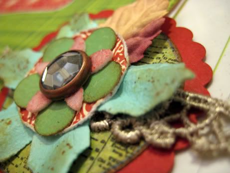
Layering! Hurrah! Thanks to Wendy and Christine I will never let an unlayered embellishment near a layout again. :) Besides, it helps me to overcome my Snobbishness and mix up those Companies. This one fetaures stash my Dad bought from a boot sale, BG Cupcake, BG Boxer, Crate Cottage, Prima, American Crafts and a flower that came from goodness only knows where!
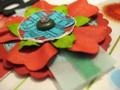
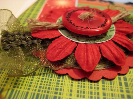 This one is my favourite. It's a shame that the Boot Sale Stash only had one piece of each item, so that's the ruffley green ribbon all gone and the red button with the doodly edge all used up. Still, must stop stroking and start using.
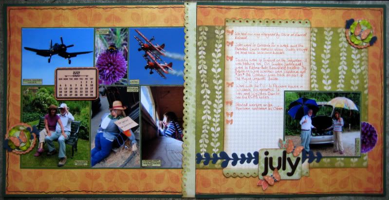
Project 12 - July
Once again I've had to take photos in less than perfect conditions, which is a shame, because I'm actually really happy with the way this Project 12 turned out. Best one in my album so far.
 {click for full size}

 I left some gaps for stuff I don't necessarily want plastered over the net, they're filled in now.


 {click for full size}

 I left some gaps for stuff I don't necessarily want plastered over the net, they're filled in now.


Monday, 2 August 2010


Sorting Flowers

They look a lot better. I did the buttons yesterday and they also look as though they'll be easier to find / use now.
Tuesday, 27 July 2010
Twisted Sketches #59

I've not tried posting a layout from my iPhone before. No playing with it in Picasa and Paint Shop Pro, just direct from my craft table to my Blog!
Of couse, it also means I won't really know how it looks until I get online properly, but it's an experiment!
The Twist this week was "stars", of which there are three. Or four if you count the huge star that is Melman.
Papers are by Scrap Within Reach, Industrial Park collection.
Monday, 26 July 2010
Layering

they do look better in real life.
Saturday, 24 July 2010
Up Up and Away!
Haven't touched anything but the Kaisercraft for days! Here are the latest three - you need to click to enlarge:
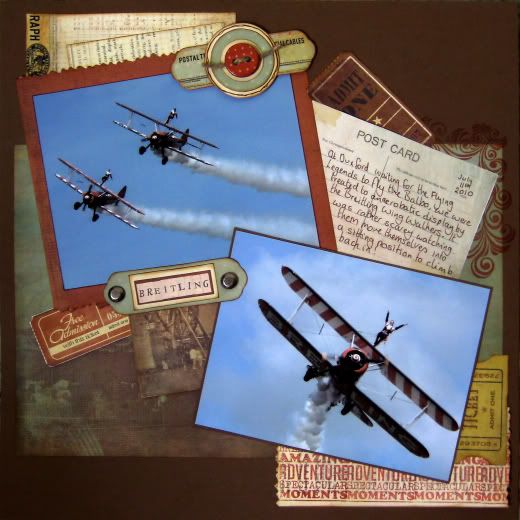
The Breitling Wing Walkers do their wing walking at Duxford before the Flying Legends fly past. It all looked like great fun until you realise that they have to climb off the wings and back into the planes in mid-flight!
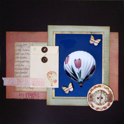
One of the balloons at Albuquerque. I took this one especially because of its patchwork look and thought it would be a fun one to scrap. It's taken me almost two years to get round to scrapping it! Used my Martha Stewart butterfly for the first time and adapted an idea from the Studio Calico blog. They suggested creating faux washi tape using the material tape you get from the pharmacy, I thought I'd give it a go by stamping onto masking tape. Seems to work!
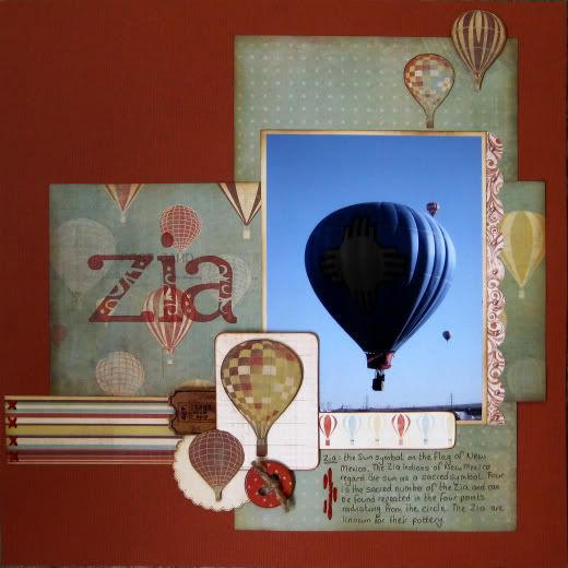
Another balloon from Albuquerque. For more information on the Zia of New Mexico click here.
Very bizarrely all the photos on the layouts have brightened after I took their pictures! On the layouts the colours in the photos are much more muted as I used the desaturation technique on them. Running them through Picasa to sharpen them up seems to have brightened them up as well...
Very bizarrely all the photos on the layouts have brightened after I took their pictures! On the layouts the colours in the photos are much more muted as I used the desaturation technique on them. Running them through Picasa to sharpen them up seems to have brightened them up as well...
Design*Sponge
Came across Design*Sponge today in my general blog surfing at work. Some great things to look at and be inspired by, but most of all a City Guide to Bristol! There are some places listed there that I'd never even heard of.
Next trip home will certainly have to involve a trip to Mouse to Minx on Christmas Steps. Never even knew it was there.
Excellent!
Thursday, 22 July 2010
Storage Issues!

room! What on Earth am I going to do with them?!
They're pretty cool though... :)
Subscribe to:
Posts (Atom)