Showing posts with label Tim Holtz. Show all posts

Sunday, 14 August 2011

Explore : Prompt 18 ~ Creating Stage A layouts

This really didn't suit me. I expect that's because I barely have time to create a full layout in a day, let alone starting four and taking them to a semi-finished point. Besides, having areas stuck down and then wishing that the newly added section could go under that bit or that bit and not being able to was rather hampering.

I chose four pieces of WRMK papers from the White Out Collection.

Also totally forgot to take pictures of three of the four in their A state. Anyway, here are the three layouts that I've finished to Stage B:
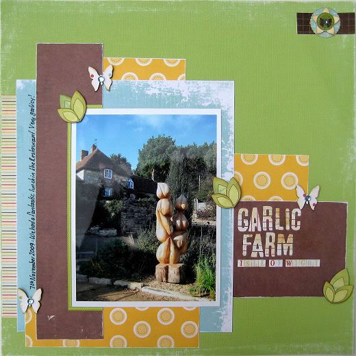

This is the one where I'm most happy with the technique. I was able to add scraps of Cosmo Cricket: Garden Variety and I think it's worked out quite well.
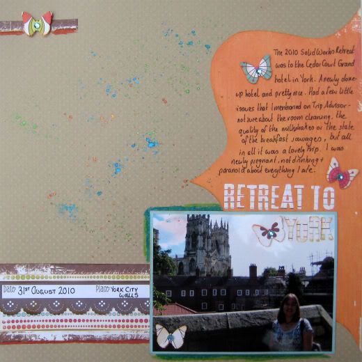

All I could add to this was ink, journalling and the date / place tag. I'm not that happy with the layout.
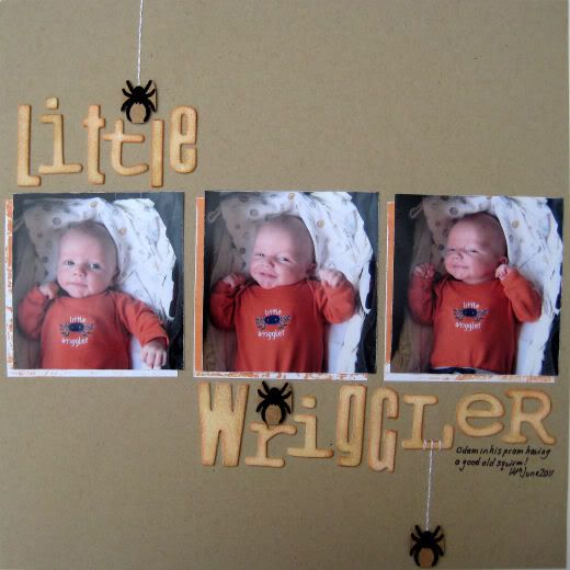

This one barely features the chosen papers at all! That's probably why I like it so much! All I did to take it to Stage B was to add the dangly flocked spiders.

I'd write more, but the baby is yelping!

Saturday, 19 June 2010

Twisted Sketches #54

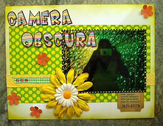
This week, the Twist is "Bold". I chose to interpret that as Bold colours, and here it is:


I took the photo at the Camera Obscura, Edinburgh, in their World of Illusions. They have a Tunnel of Stars and if you play with your camera exposure settings you can get some fun results.


I could have spent hours in there just playing with the settings and the lights!

Wednesday, 16 June 2010

Paper Snob?

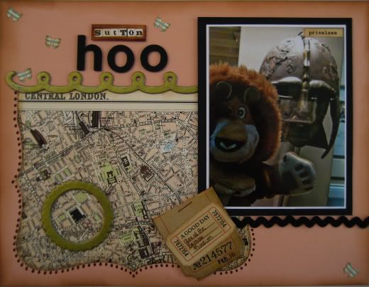
I did these two layouts last month when I thought I'd see if I really was a Paper Snob! I made a layout using some cheap American Crafts products that I bought from the home store round the corner. Now, don't get me wrong, I do like a lot of what AC does, enjoy their Remarks stickers, cardstock, Thickers, Flair, blooms, buttons etc. On the other hand, I tend to not like their papers. Maybe it's the design, or the colours.

Until I bought this cheap kit I hadn't realised that AC seem to have two types of paper. Thicker, double-sided papers and much thinner single-sided papers. They also must do a slightly inferior type of alpha as well. I made this first layout mainly using the bits that came in the kit. There were some odd photo matts in bizarre shiny card, as well as the thin papers, and non-sticky alphas. I had to re-glue the title down twice because it wouldn't stick.

There was nothing wrong with the Flair or Remarks, but in the end, I wasn't happy with this layout. So I thought I would scraplift myself and use some papers that I love with all my Paper Snobby Heart - October Afternoon's Thrift Shop - and see if what I came up with was something I preferred.


To be honest. I'm not entirely sure which one I prefer. I think I like them both. I suspect I chose the wrong subject matter for the second one. When I saw that old London map paper, I couldn't wait to use it, but the only pictures I had of London were these few of Alex, which I took at the British Musuem (circled on the paper!) on my iPhone.

Of course, as it turns out, the second layout uses AC Thickers in both the title and in some of the chipboard embellishments!

I think I still am a Paper Snob, I do prefer working with thicker, double sided papers with gorgeous prints, but I know I can use the other sort as well.

Thursday, 8 April 2010

Gutter Girlz

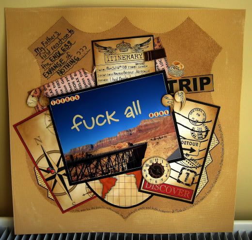
This is my first time submitting to this challenge site and it looks like fun! I've been wanting to scrap this for a long time, well, not the picture, but the quote. It was such a memorable part of our Road Trip that I knew I'd have to eventually, but scrapbooking has always come across as so sweet and innocent that I wasn't sure I really should be using the F-Word... *horrors*!

Of course, that's crazy. Scrapping is a personal experience. I could have created this layout, put it in my album and never shared it online. Then my Teamie Sue posted the link to the Gutter Girlz and I realised that actually I can scrap what I please and can even show it off!

So, here's my entry for Prompt #35. I've used the Prompt - Road Trip, and the Product - a Map. I've not used the song as I don't know it and it won't play from the GG website here in the UK.


Let me point out that my father doesn't swear, which is why him saying this was so funny.

We'd travelled from Vegas (you know, crowded, buildings, lights) and were on the way to Mesquite. This involved going through a large expanse of nothing. Big skies, endless desert, hills that were pretty much mountains and long straight stretches of freeway. There'd been an hour or so of this when my Dad comes out with his now-classic "There's fuck-all here!"

To be honest, I think he was bit worried that we'd be stuck for two weeks looking at nothing!

Of course, we then detoured through the Valley of Fire State Park and that was that. There isn't fuck-all there after all, you just need to learn to appreciate the desert for its beauty.


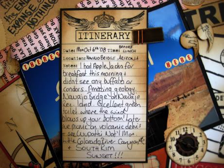
The photo is actually Navajo Bridge, so I've journalled about that rather than about the Valley of Fire, but it symbolises big skies, desert, etc and shows that there are things to be seen in the desert after all.

It wasnt until after I finished this layout that I realised that I have blatantly scraplifted Gutter Girl Susan! I must have seen it, registered it and forgotten all about it. Sorry about that, Susan. :(

Saturday, 20 September 2008

*hug*


Made this for Pencil Lines #102. My Dad and OH in the Cambridge Botanical Garden. Used bits of Doodlebug, Crate Paper, Bazzill and Prima flowers.