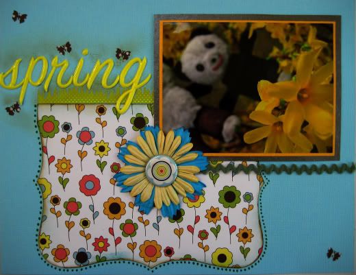
Until I bought this cheap kit I hadn't realised that AC seem to have two types of paper. Thicker, double-sided papers and much thinner single-sided papers. They also must do a slightly inferior type of alpha as well. I made this first layout mainly using the bits that came in the kit. There were some odd photo matts in bizarre shiny card, as well as the thin papers, and non-sticky alphas. I had to re-glue the title down twice because it wouldn't stick.
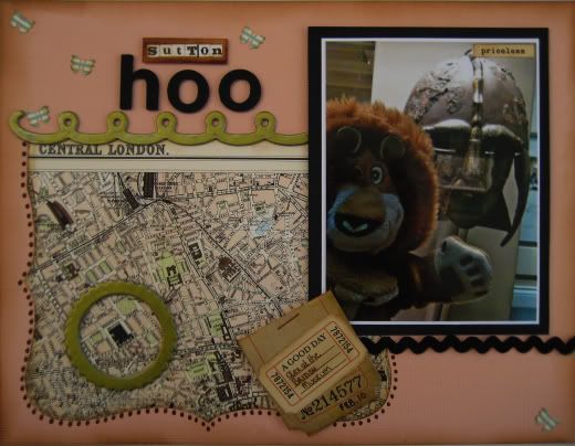
 There was nothing wrong with the Flair or Remarks, but in the end, I wasn't happy with this layout. So I thought I would scraplift myself and use some papers that I love with all my Paper Snobby Heart - October Afternoon's Thrift Shop - and see if what I came up with was something I preferred.
To be honest. I'm not entirely sure which one I prefer. I think I like them both. I suspect I chose the wrong subject matter for the second one. When I saw that old London map paper, I couldn't wait to use it, but the only pictures I had of London were these few of Alex, which I took at the British Musuem (circled on the paper!) on my iPhone.
Of course, as it turns out, the second layout uses AC Thickers in both the title and in some of the chipboard embellishments!
I think I still am a Paper Snob, I do prefer working with thicker, double sided papers with gorgeous prints, but I know I can use the other sort as well.


1 comment:
I like both layouts for different reasons. Once the paper is stuck down surely you don't know whether it's thin or thick and double sided?
Post a Comment