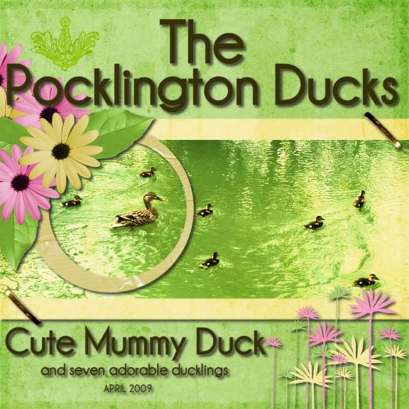
 We had to do the layout based on packaging, film poster of book cover. This is the adapted cover of The Visitor by Sherri S Tepper. Something transforming, so I chose Ducks growing up! Also spring colours and gold - tick and tick! :)
Sunrise by Sweet Blossom Designs
Font - Champagne & Limousines


3 comments:
Fab LO, and love how you've used the book cover as inspiration. Thanks for taking part in our challenge
Oh this is so cute
I love the colours of this and the picture is adorable.
Post a Comment