SLYMI was a minimalist sketch, so I was able to use up the final largish piece of paper. I do love 'white space' layouts.
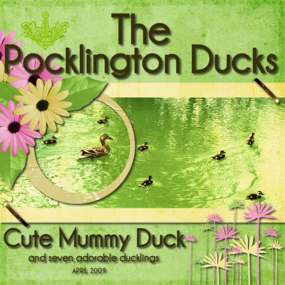 We had to do the layout based on packaging, film poster of book cover. This is the adapted cover of The Visitor by Sherri S Tepper. Something transforming, so I chose Ducks growing up! Also spring colours and gold - tick and tick! :)
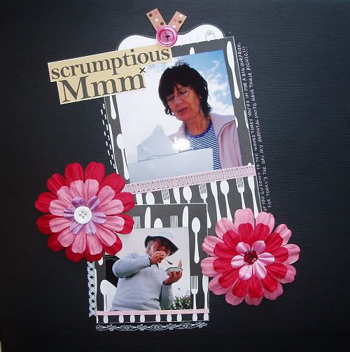 Mmm... tuna light lunch.
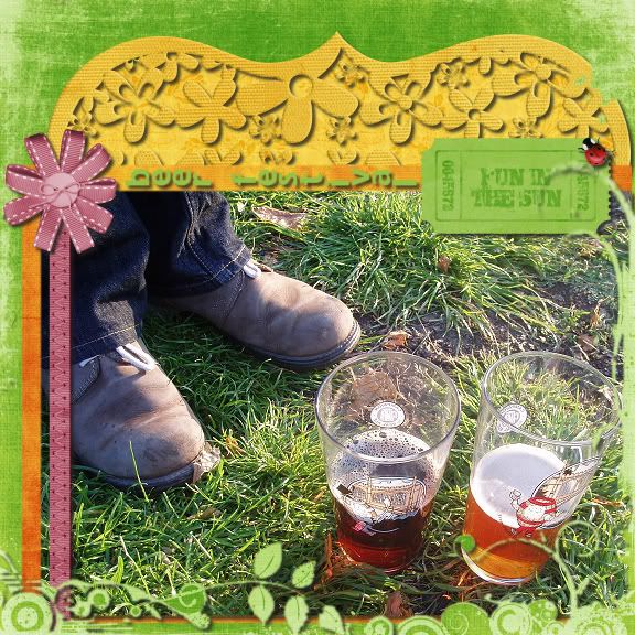
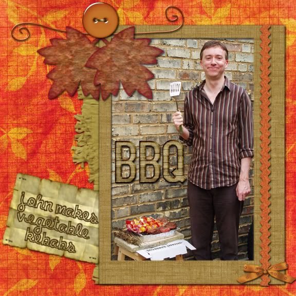 Our fabulous barbecue with homemade rosemary kebab sticks - yum.
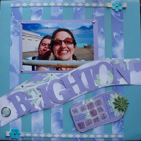 An inter-team layout from our early days as a team. I'm not really sure I like it. :(
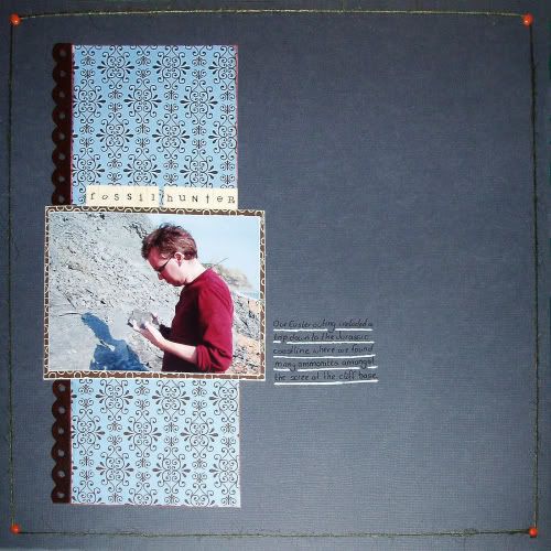
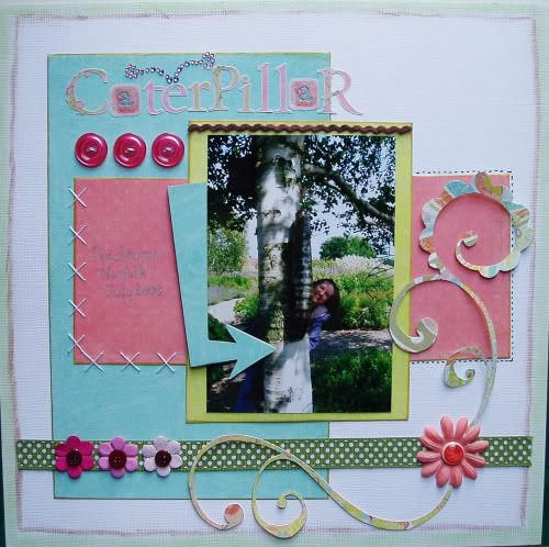
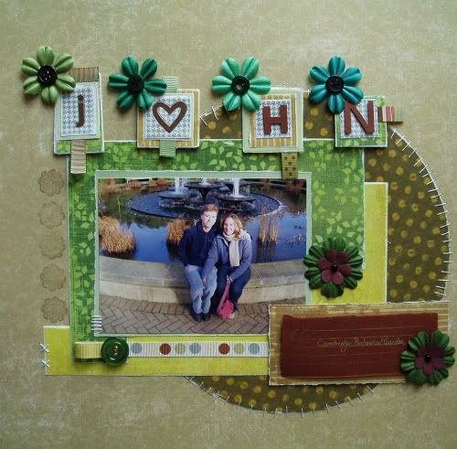 Cambridge Botanical Garden.
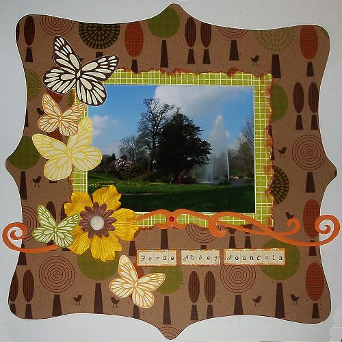
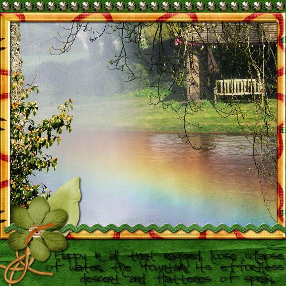 Had to use the colour emerald, bling, poetry and movement. Obviously I can't make a movable digital layout, so I chose a picture featuring movement - a fountain.


